All right, it's time for another installment of indicators humor -- for those of us who chuckle at this sort of thing.
Graphs can be funny. The classic example is this one:
A humorous graph designed to make a point and spur change can be found at the Flying Spaghetti Monster site:
For a series of graph-related humor, check out the Indexed blog -- here's a sample: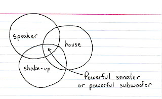
Also click here for a graph that purports to show Wayne's World movie and TV viewings and Bohemian Rhapsody-related car accidents.
What are your favorite graphs that make you smile?

What $1 trillion buys
-
Elon Musk became the world’s first trillionaire with the SpaceX initial
public offering…
*Tags:* Bloomberg, Elon Musk, illustration, net worth, scale
3 days ago


0 comments:
Post a Comment