I've been getting some grief from folks who want to know why I haven't posted my presentation from the NAPC Conference on Data Displays -- 30 Examples in 30 Minutes. The short answer is that the presentation was a conglomeration of a whole lot of stuff that didn't fit easily into one PowerPoint presentation, and the mishmash of stuff that WAS in my Open-Office-Powerpoint-equivalent-presentation is way too big to e-mail. I tried PDF'ing the whole thing and lost most of the fun interactive portions, and then tried re-creating the whole thing as a movie, but ended up aggravated by the limitations of time and technology to do what I wanted.
Enough of my whining. After the jump are the different examples I showed the group -- the intent was to get a conversation started and people thinking about new ways to tell stories with data, and for those who have been following this blog for a while, nearly everything I shared has been discussed in much greater detail already. I hope you enjoy the overview -- feel free to remind me of all the really cool stuff I left out.
Now click on the link to get the whole presentation. (For any of the images, clicking on them should make them larger and hopefully more readable.)
To get the group moving and a little less scared of talking about data visualization techniques, we began with Sid the Science Kid:
(Go ahead and play the video. This is fun. Dance along if you need to.)
Introduction
When we work with data in communities, we use that data to tell stories and inspire action. Data should make our story-telling more relevant, impactful, truthful, and powerful.
Instead, we take good stories like this one:
And then we use data to turn them into messages like this one, which drains any of the excitement and meaning out of the story:
 Hans Rosling talks about the importance of good data presentation by showing sheet music from Chopin, and asked if we could tell how beautiful it was. A composer, who specializes in this, can look at the notes and see the beauty. We can't, because all we could see were the notes -- we needed an instrument and someone to play it. Even an electronic keyboard, would help -- they're inexpensive and a child can play them. Too often we get excited about statistics, but all we present to the public are the notes, not the music.
 If you haven't seen Dr. Rosling present, go right now to http://www.gapminder.org/ to see him in action. This is his presentation where he talks about Chopin -- it's all in the first minute or so before he introduces GapMinder. You'll also really enjoy this presentation on global development as he uses GapMinder to tell amazing stories.
Nathan Yau says, "Approach data visualization as if you were telling a story. What kind of story are you trying to tell? Is it a report or is it a novel? Do you want to convince people that something is necessary? Think character development. Every data point has a story behind it the same way that every character in a book has a past, present, and future. There are interactions and relationships between those data points. It's up to you to find them."
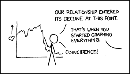
Summary: It's not the data, it's the presentation. Just see what XKCD has to say about it:

So much for the introductory remarks.
Where do we begin?
We start with understanding the type of visualization that matches the kind of information we have and the story we want to tell. Three very good resources are available for us to make those decisions:
(I know I only shared two at the conference, but I meant to show all three and just ran out of time.)
- www.ChartChooser.com is one approach that brings the template you choose back into Excel for you.
- Andrew Abela's Flow chart for charts should be printed out and hung above your desk.
- The Periodic Table of Visualization Methods is more fun than we should be allowed to have on company time. Use your mouse to discover all the options they have for you. The color codes help you determine which of the options fit the data you have and the message you're trying to convey.

Creating Data Displays Online
You may want to use a number of online tools to share your story. Here are some useful ones you should be aware of:
Swivel is a fun way to create graphs and share data.
Many Eyes is similar in its approach, with different visualization tools available.
Widgenie adds a little movement when you share graphs online.

And for ease of use and the unusual nature of the "data" presented, nothing beats GraphJam.
Making It Move
This next section looks at how you can tell stories better when you've got the notion to add a little motion. This may not be the approach you want to take with all the stories you have to tell, but for some messages, movement makes the data come alive.
We mentioned GapMinder earlier. Now click this link to see what GapMinder technology can do to tell multi-faceted, time-series stories that hit close to home.
Now check out the emotional impact available when you use data and motion together at So Many a Second.
Twittering the Super Bowl? See what the New York Times did to remind us that data can tell their own stories, if we let them.
A couple of years ago, I shared a motion-based graph from Speculative Bubble at the NAPC conference, to warn us to prepare for the coming real estate collapse. Atari's Roller Coaster Tycoon 3, a game program, was used to create a roller coaster that follows the trend lines and lets you "ride" the graph. Compelling, isn't it? (Hold on to something while you watch this!)
Mapping Worlds lets you choose between the USA and the World for data displays. I like this map of the aging population:
And that should transition us to:
Using Maps To Tell Your Story

The first site I wanted to link to was DataPlace. Right now, it's undergoing site maintenance -- I'll add something more to this when it comes back online -- unless I forget, in which case feel free to remind me to do so.
So go to PolicyMap and poke around -- there's a great deal of free data (registration required, but that's free too) and additional information/tools available for those who subscribe.
Instant Atlas is another mapping software tool -- this one's not free, but the samples are really interesting examples of how to use maps to tell stories with data.
Don't forget Google Earth as a free mapping software tool with opportunities to customize the display with your own data. Google Earth is inspiring a great number of mashups, such as CrashStat 2.0 and EveryBlock -- as great examples of what you can do with data and maps to create messages and transmit information.
I don't think I had time to do more than holler out "Check out GraphWise!" in my presentation. I said a little more about it here when it was first launched. It's not loading right for me today, so fans of GraphWise should remind me to say something more about it when I can get back into the site.
I closed the presentation with a rapid-fire look at some imagines that use graphs and images in ways to make people sit up and notice. I called this section:
Getting Their Attention
Let's start with pie charts:
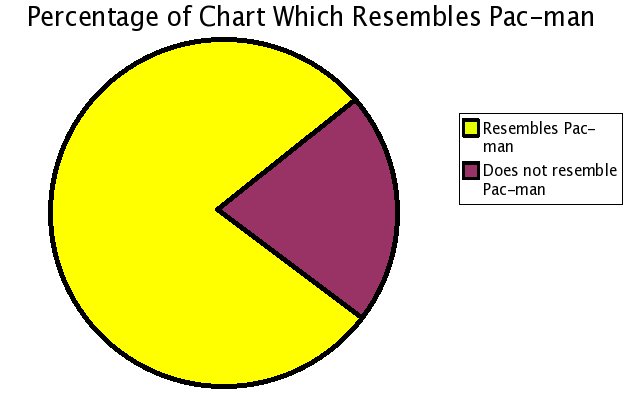
One pie chart:

Pumpkin Pie Chart:

Chocolate Pie Chart:

Pie making you hungry? Check out these obesity statistics:

The challenge we have is to display the data in ways that provoke conversation and promote understanding. I think this chart does that. A similar U.S. map is also available:

There's lots more ideas available at Meryl's Notes Blog with a list of the 175 Top Data Visualization Resources on the Web.
If that's not enough, try this:

Are you still counting to see if I've provided 30 examples of data display techniques in 30 minutes? I'm nearly done. The last section is called:
What About the Big Numbers?
Sometimes we have to tell stories with large numbers. Making those stories come alive poses special challenges.
The MegaPenny Project tries to help large numbers make sense.
Here's another effort to help people visualize large numbers, this time using rice to tell the stories. (Watch the video at the link!)
Let's finish with Chris Jordan, artist and photographer, as he helps us understand the impact we can make with data -- if we can help people visualize the data in ways that speak to their hearts.
I'd love your comments -- what did I leave out?


Ben, GREAT -- this is wonderful! Your presentation "WOW"ed the NAPC audience at last month's conference in Austin. Ever since then, they've been contacting our National Headquarters to ask how they can revisit your information and learn more. I'm putting this link on the conference website right now, and announcing it in today's e-newsletter.
ReplyDeleteThanks!
Sharon Clark, Coordinator
National Association of Planning Councils (NAPC)
www.communityplanning.org